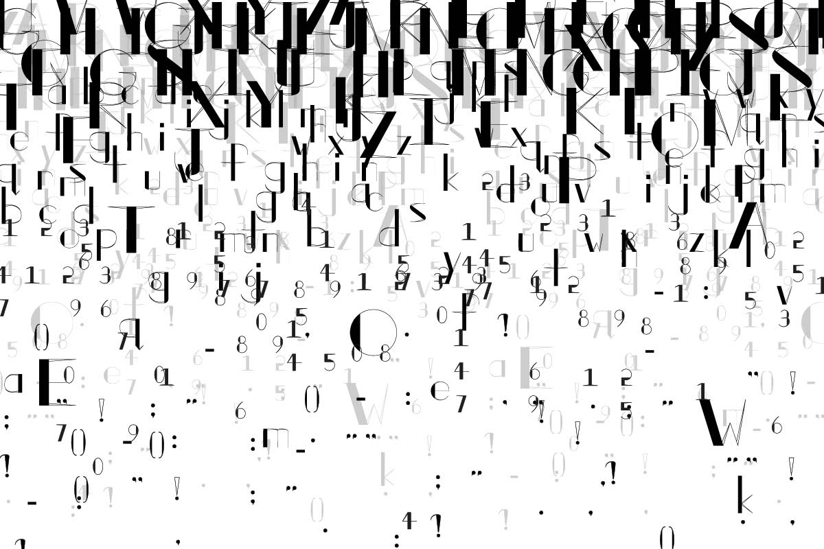
SilverLine
TYPEFACE
Research and Analysis
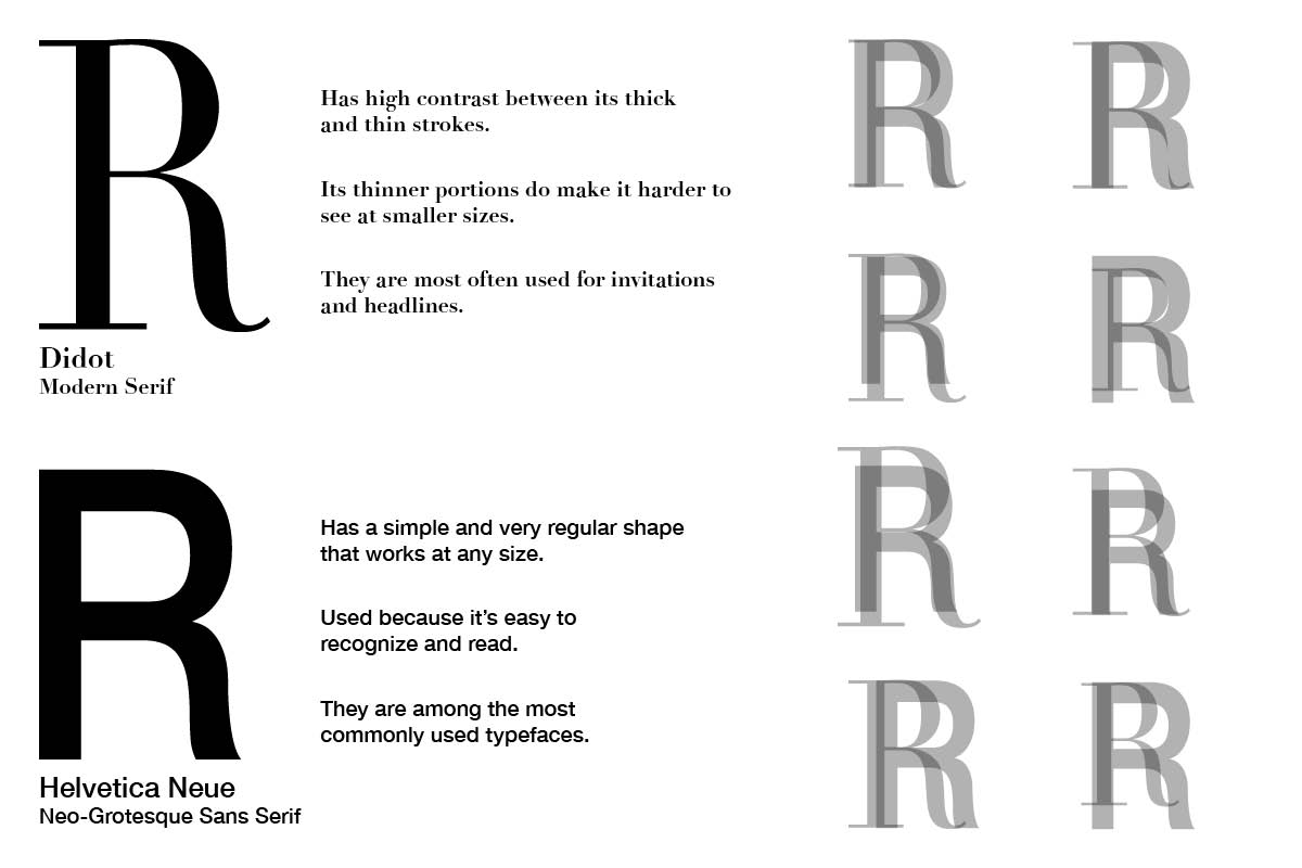
Using overlays I sought to find similarities between modern serif and sans serif typefaces in order to find shapes that I would leave or change in the new letterform.
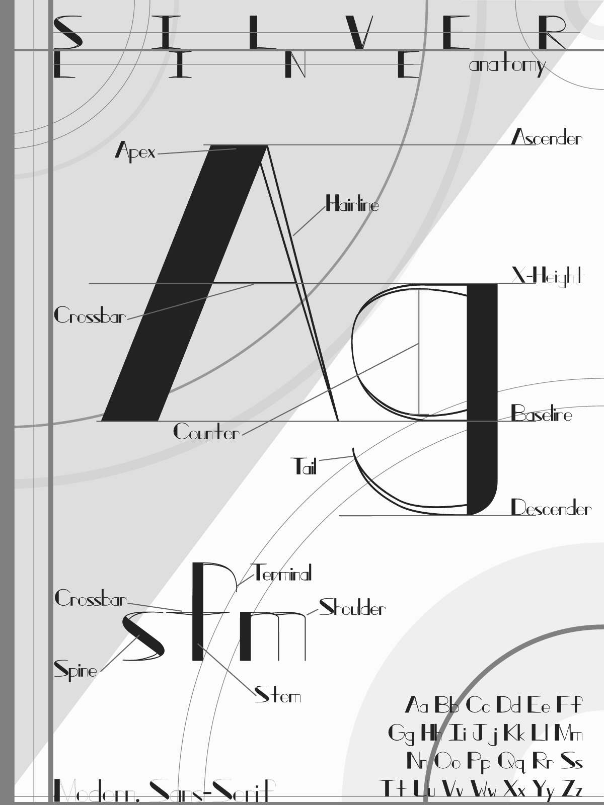
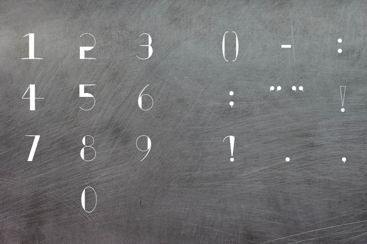
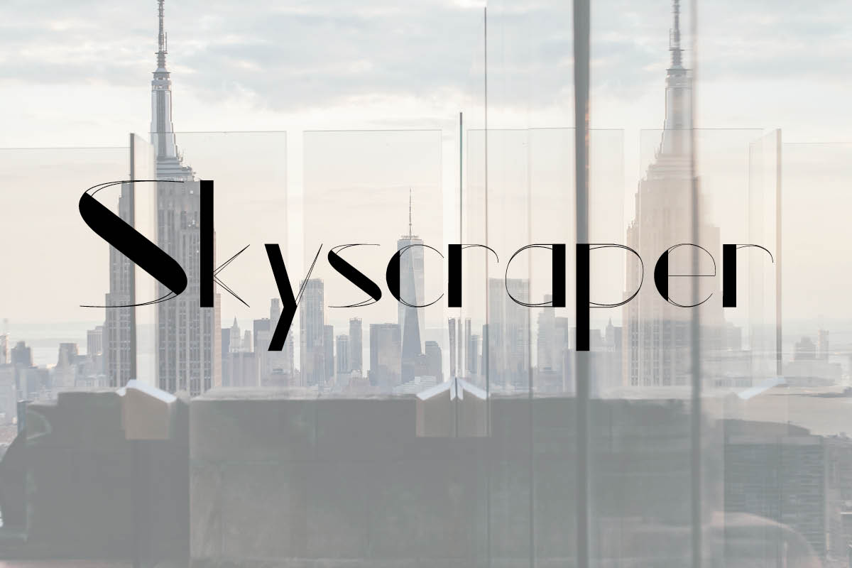
When learning about other high contrast typefaces it was noted that the thicker portions of high contrast letters are noticed first by viewers, so I designed SilverLine to be left heavy to work with how western viewers read.
Conclusion
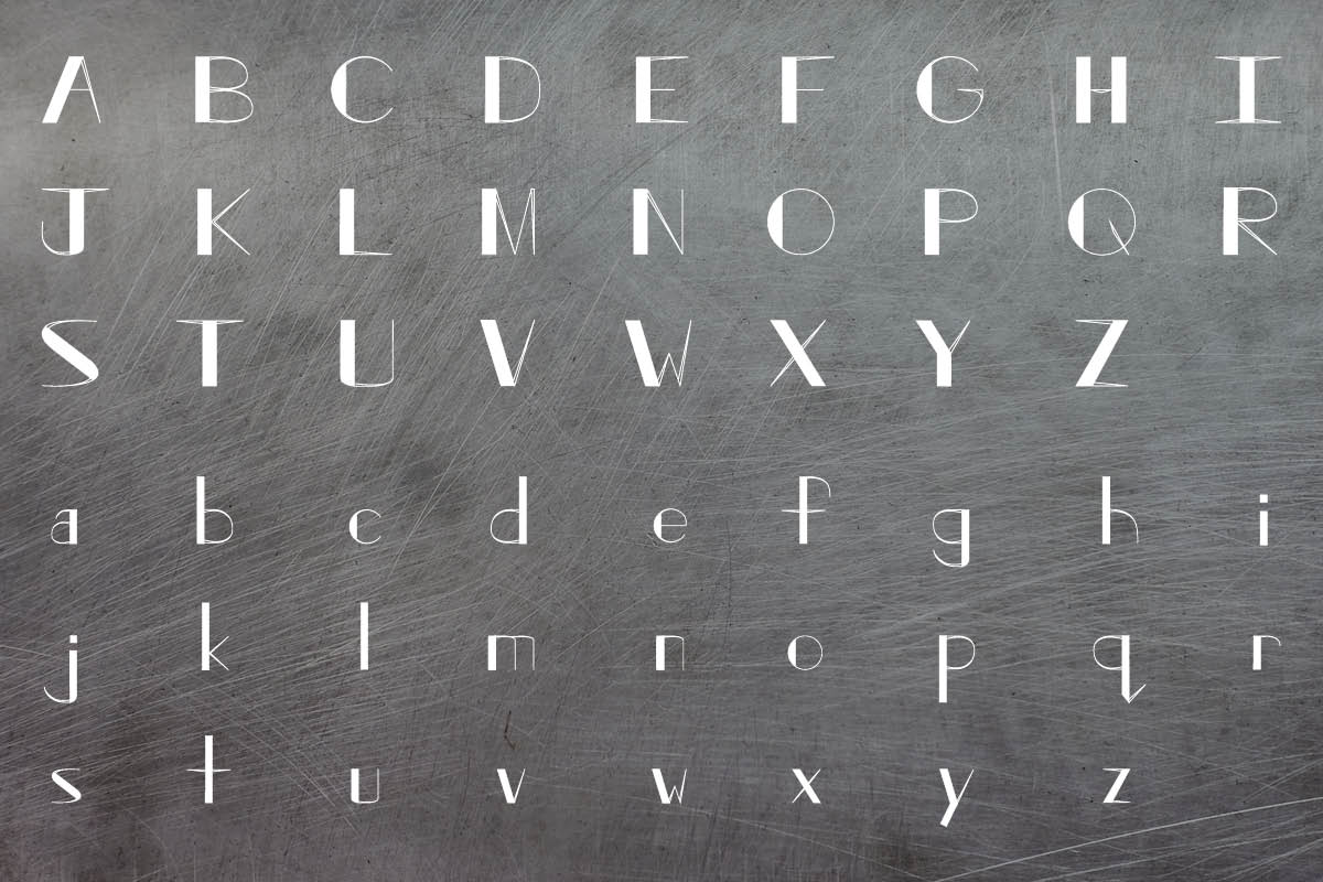
Sans serifs are the most legibly typefaces, because they are minimal; the high contrast in individual letterforms makes a typeface become less legible in smaller sizes. Also, it is important to play with the rules of design as it can lead to unexpected outcomes and better understanding.