Process
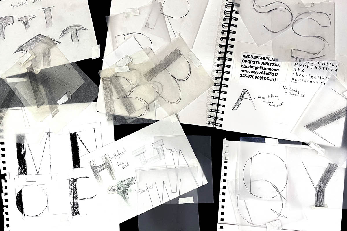
SilverLine began as an idea about how to diversify sans serifs, incorporating qualities of modern serifs into a sans serif typefaces.
Initial Sketches
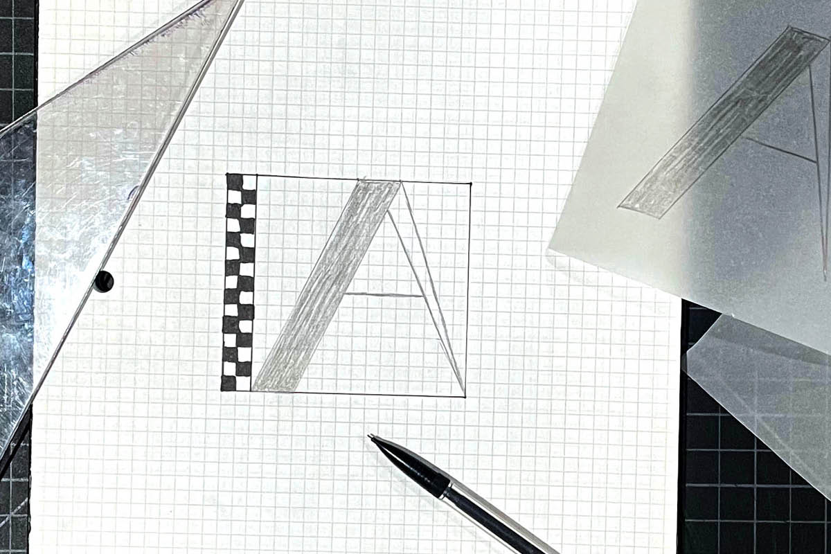
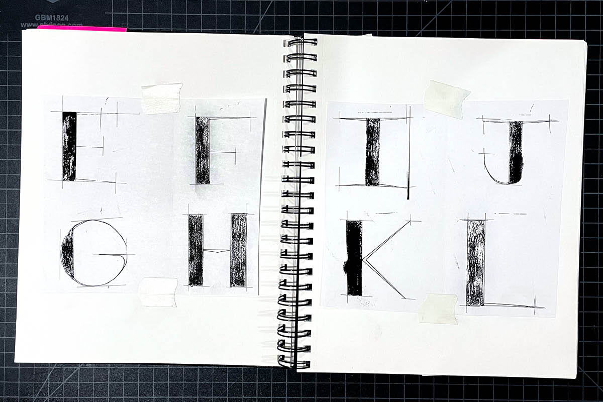
Every letter started off as graphite on a gridded square, to create a series of letterforms similar in size and shape. Each letter was then traced multiple times in order to find the desired look.
Digital Scans
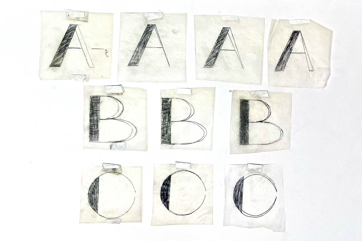
The letterforms that are selected for further refinement are digitally scanned and assessed for symmetry, alignment, and constancy to the other shapes.
If a letterform was significantly off, it would be sketched and scanned again.
Digital Outlines
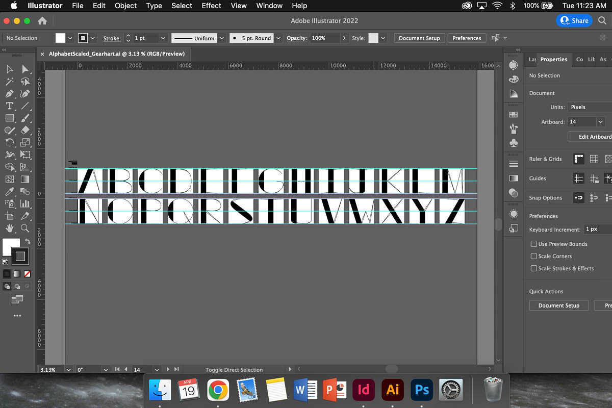
The digital scans would then be imported into Adobe Illustrator, turned into vector shapes, and further adjusted for consistency.
Fine Tuning and Kerning
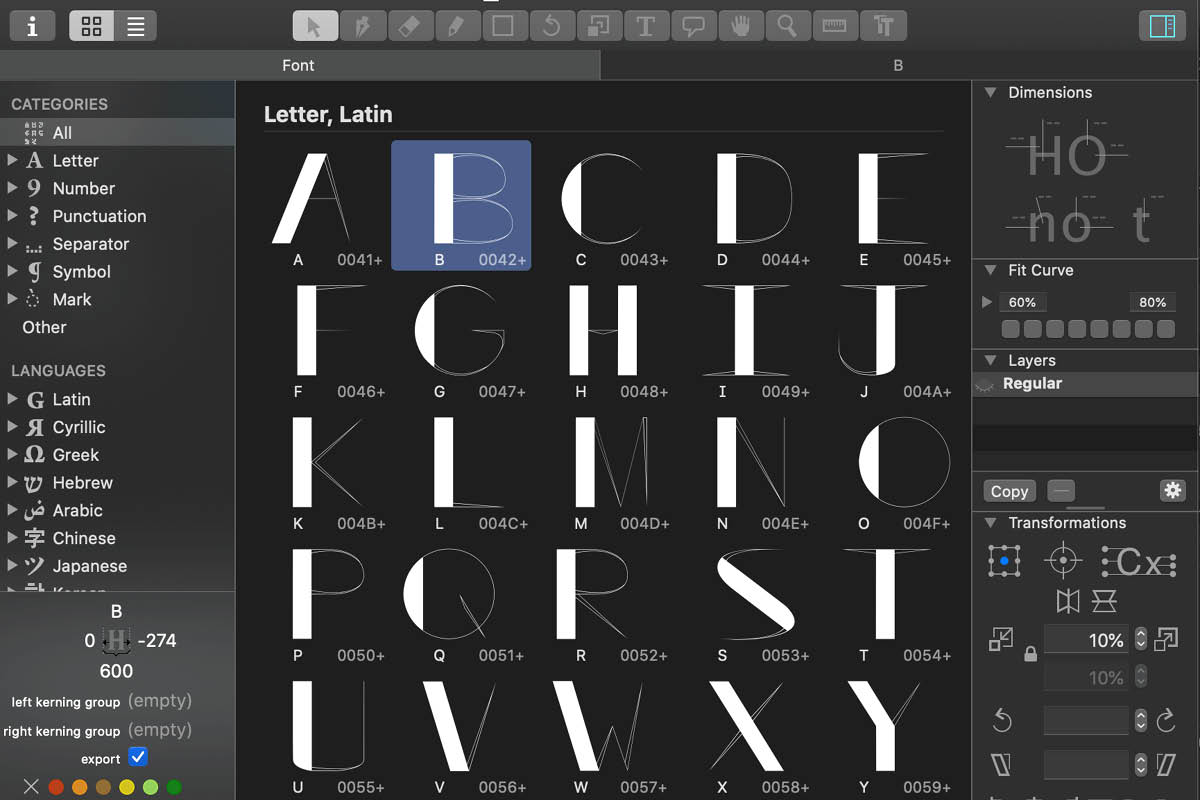
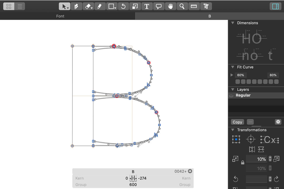
The digital outlines are then imported into the program Glyphs. The program helps fine tune the letterforms one more time, but also allows for the kerning of the letters and the exporting of the typeface as an OTF file.
Final Typeface
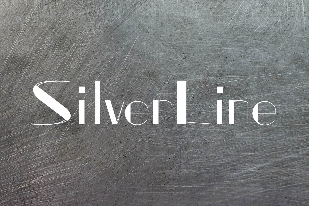
SilverLine is a high contrast sans serif that offers a modern, art-deco inspired feel.
